Rethinking UI for Facebook Group’s sign up process.
Design Case Study, Jan. 2022
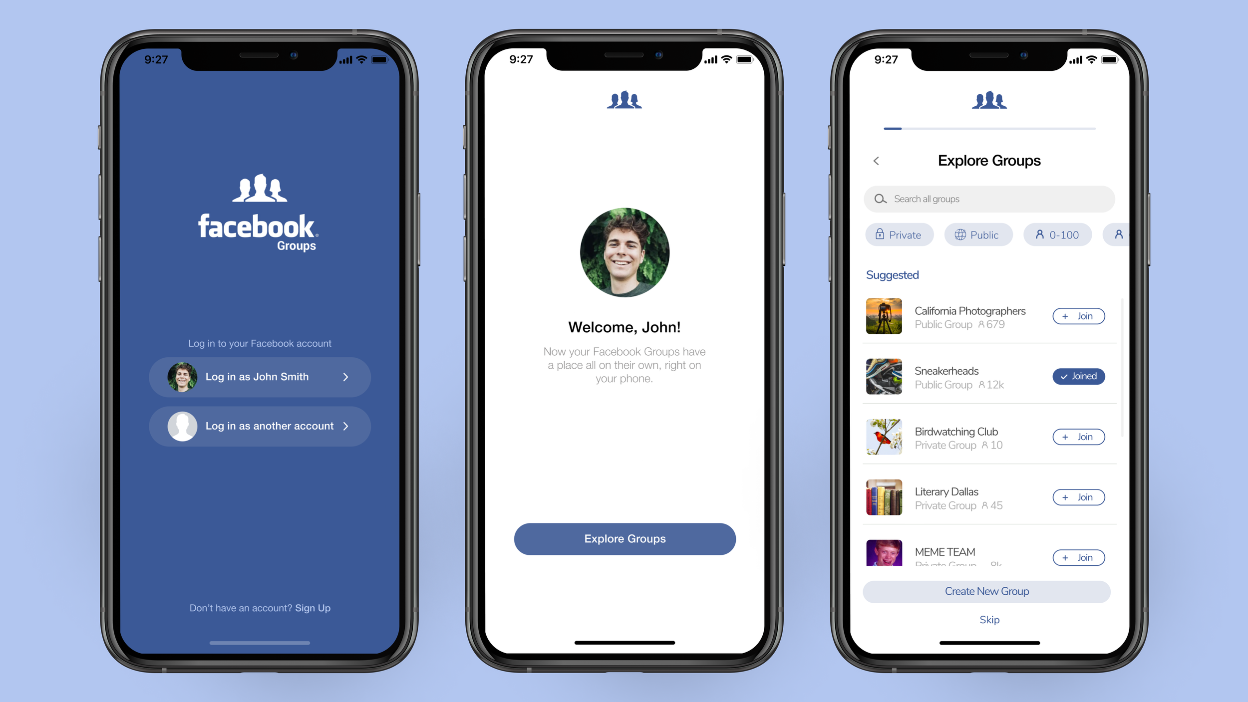
Facebook Groups are spaces on Facebook for people with similar interests to discuss or share about a variety of topics. The process for signing up for a Facebook Group through the Facebook mobile app has both shortcomings and strengths that I wanted to better understand and challenge myself to solve through a redesign.

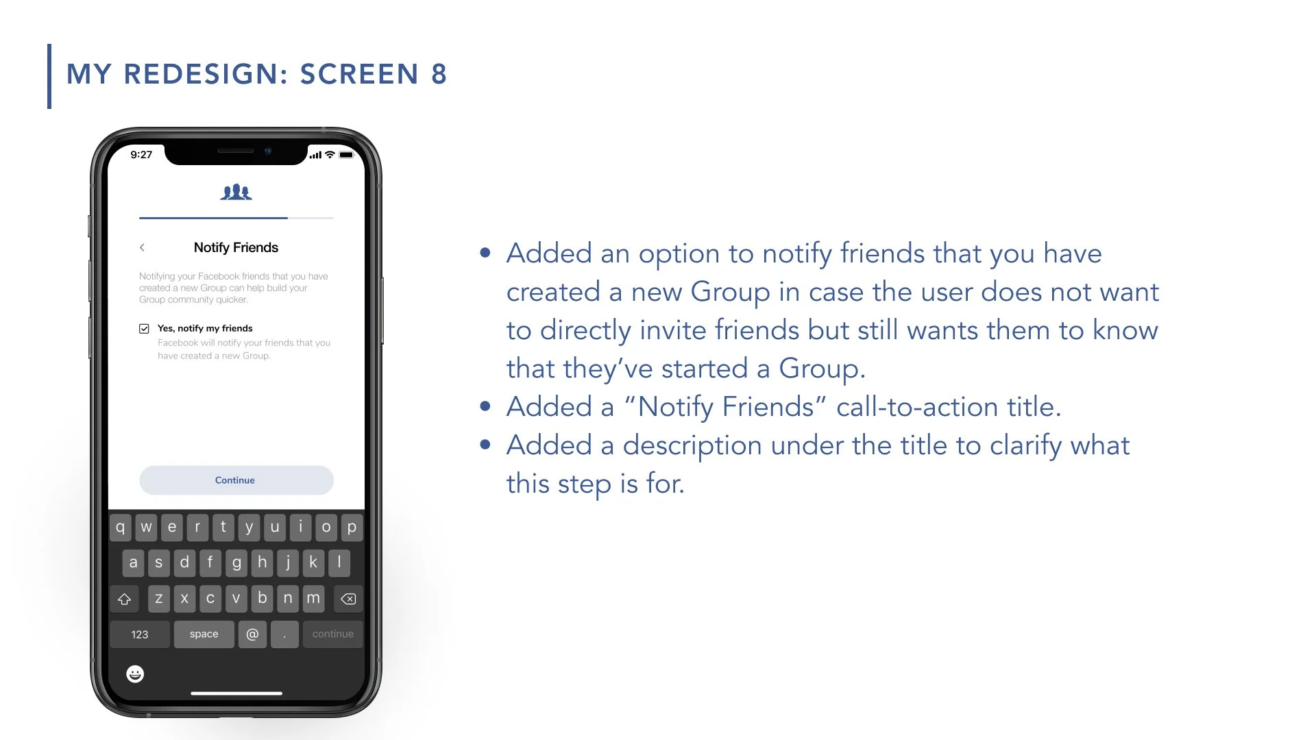
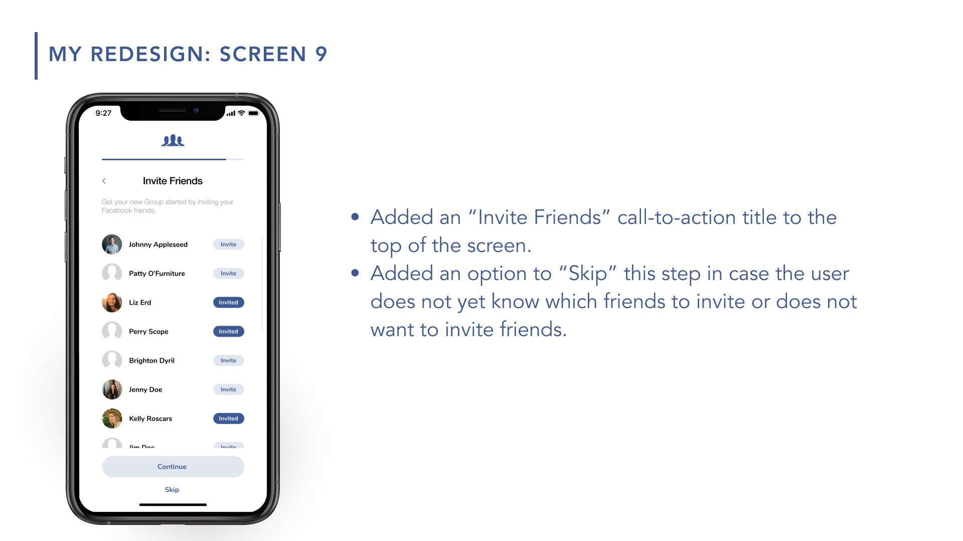
A summary of the pain points I identified and tried to address through my redesigned sign up process:
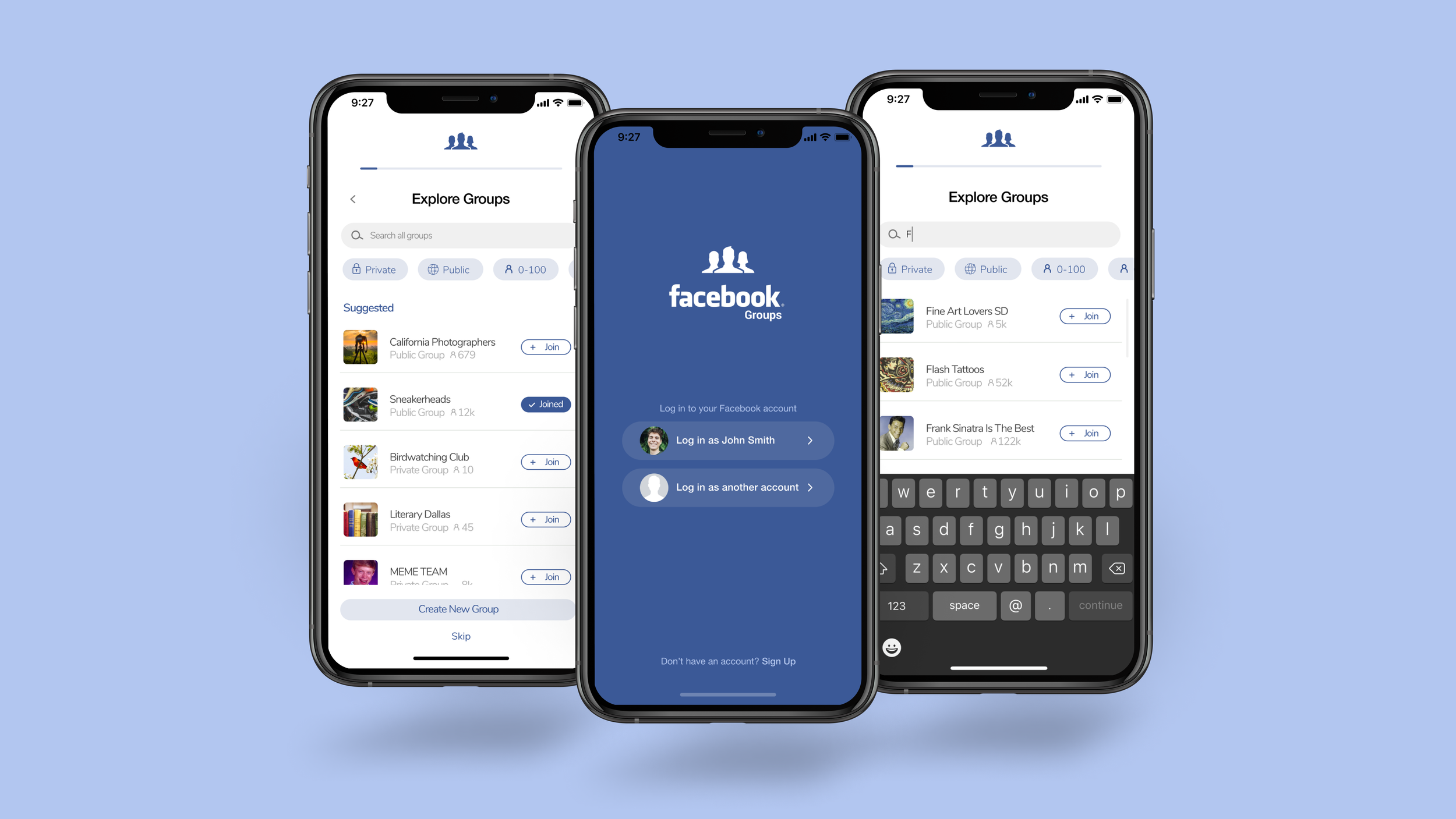
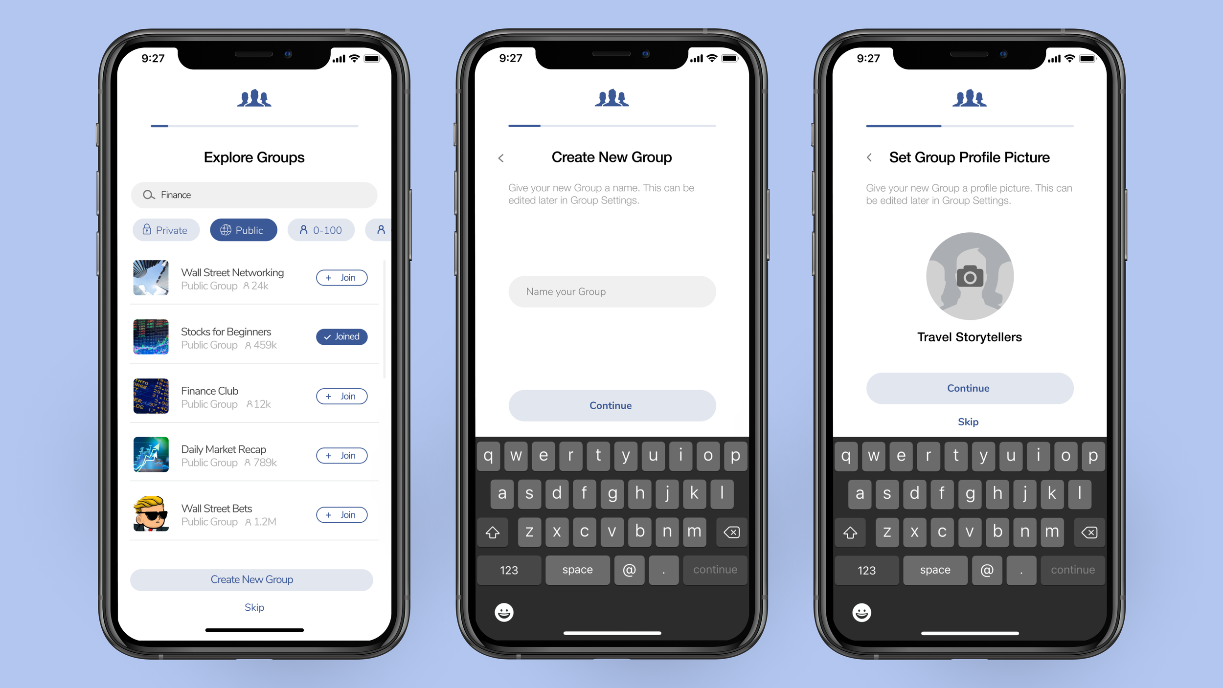
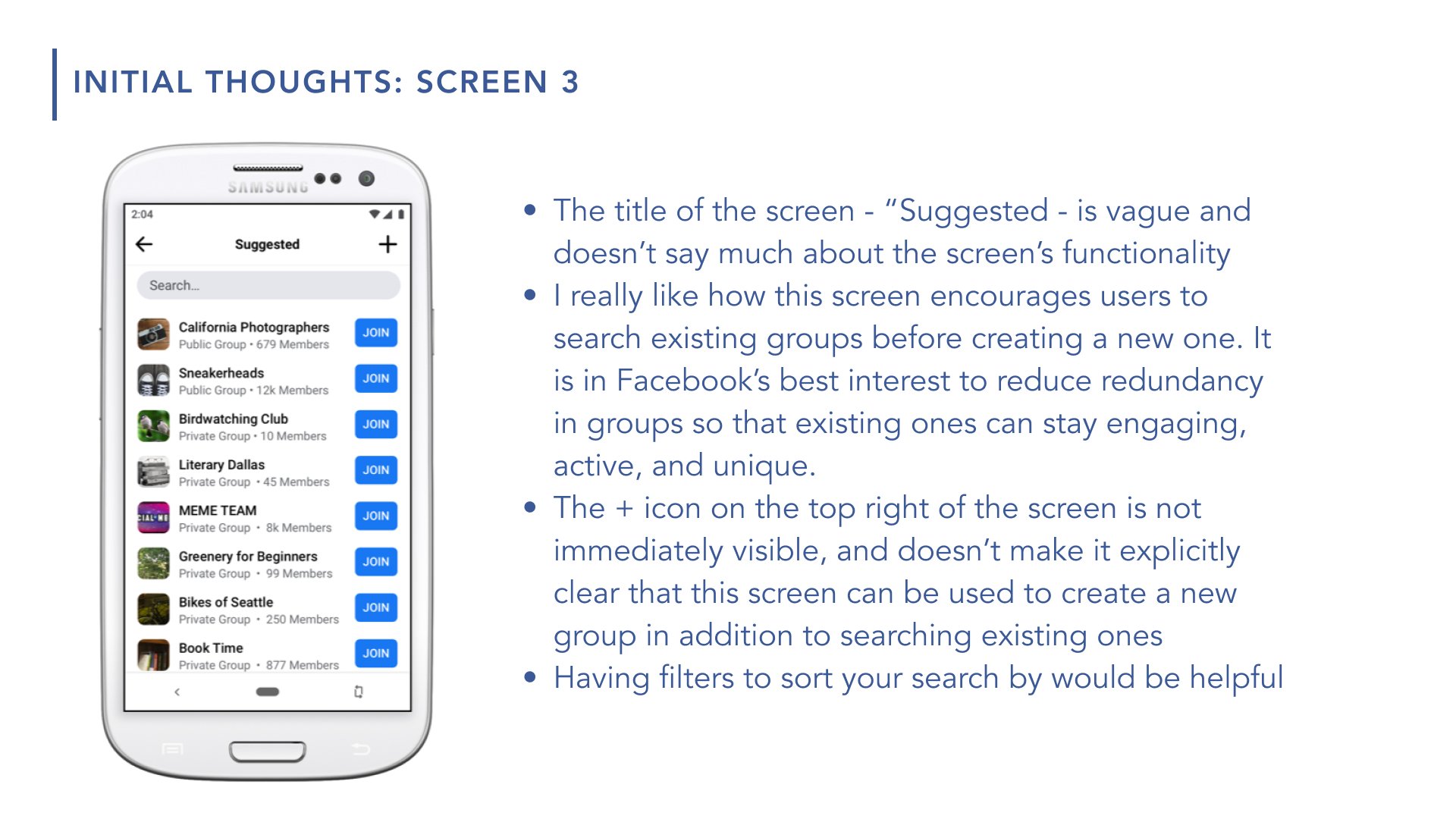
No easy way to explore or filter through existing groups before creating a new group. This might result in redundancy of groups and lack of engagement in existing groups.
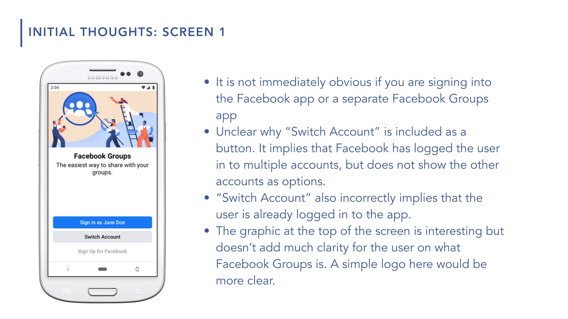
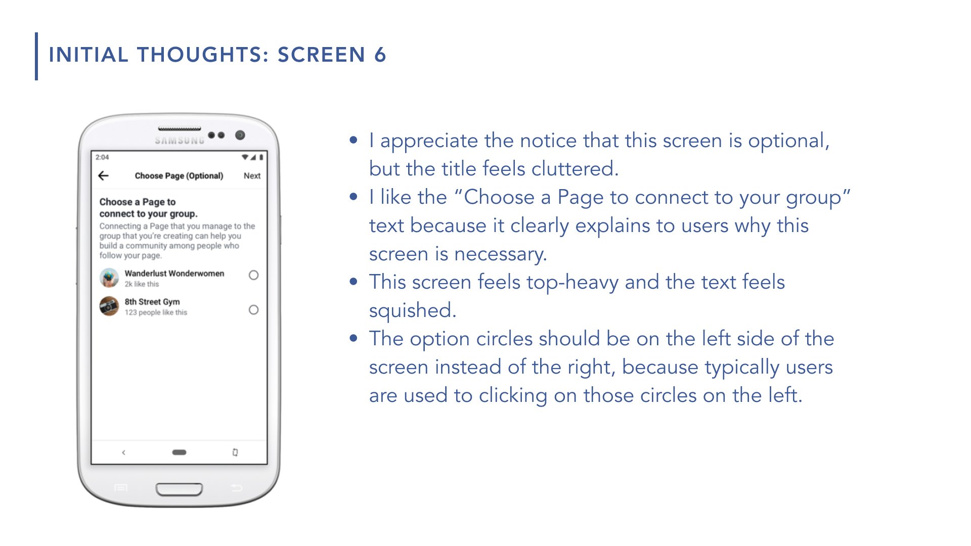
Unclear whether users must make a separate Facebook Groups account, or can simply connect a Group to their existing Facebook account.
Unclear whether users can connect existing Facebook pages to their Group.
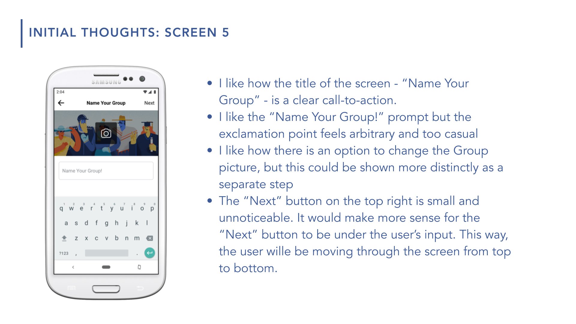
Placement and copy of certain buttons may cause confusion. For instance, the create new group button is a “+” hidden in the corner of the screen.


After defining my pain points (see above), I did a competitor analysis. Gaining a better understanding of other social media apps’ sign up processes helped me to better distinguish my redesign from the competition.
My Facebook Groups sign-up process redesign went through countless iterations, especially as I began testing out the prototype with college peers. Watching friends interact with the app opened my eyes to pain points I didn’t originally notice and helped me tweak the UI to be as intuitive as possible.
My solution is a more elegant, intuitive, and functional Facebook Groups app sign-up process. In order to validate whether or not my solution solves the problem, I would gather a diverse group of target users and have them go through both the original sign-up process and my redesigned process. I would observe and gather feedback on features, functionalities, content, and UI/UX. Then, I would incorporate the feedback and further iterate on my redesign.